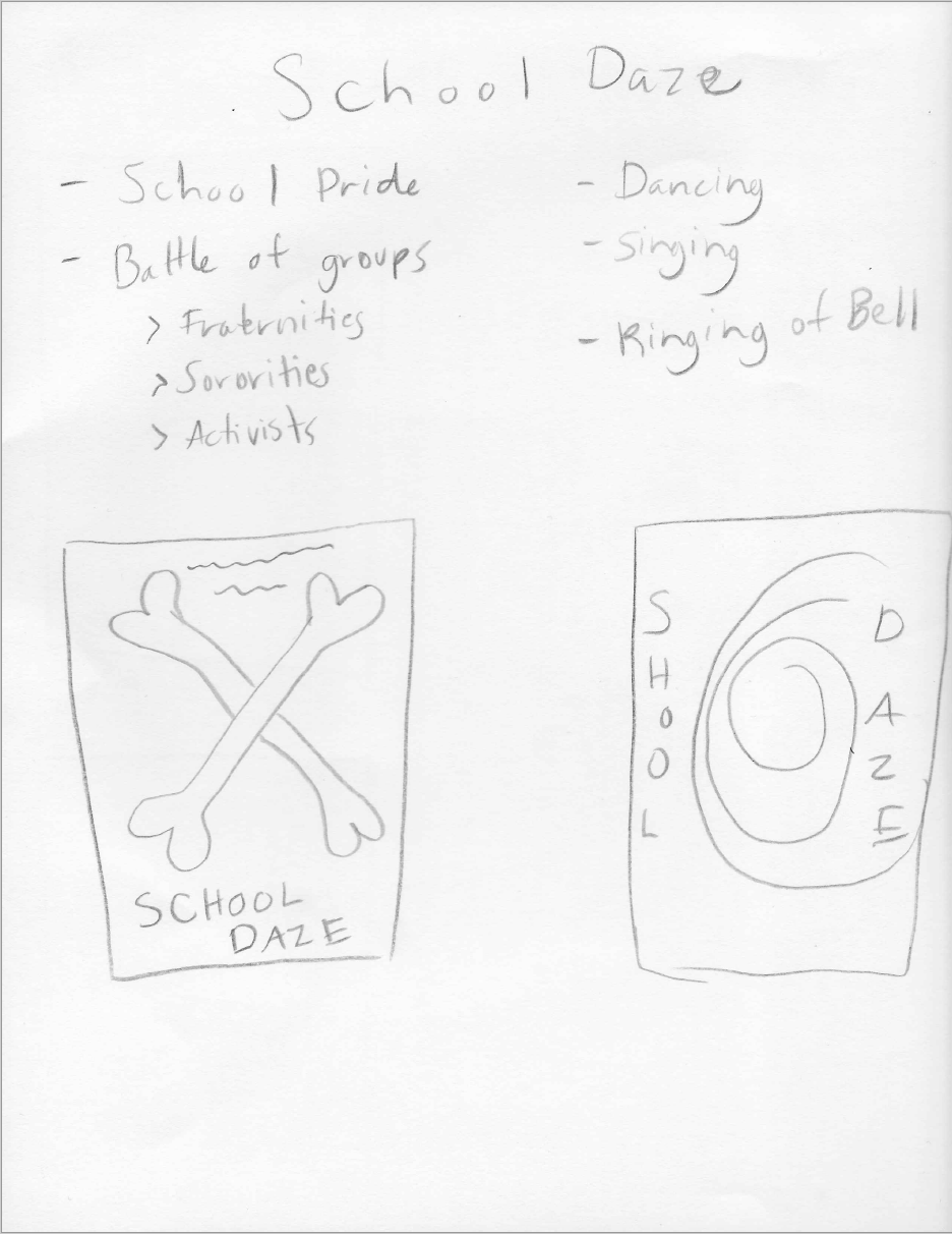
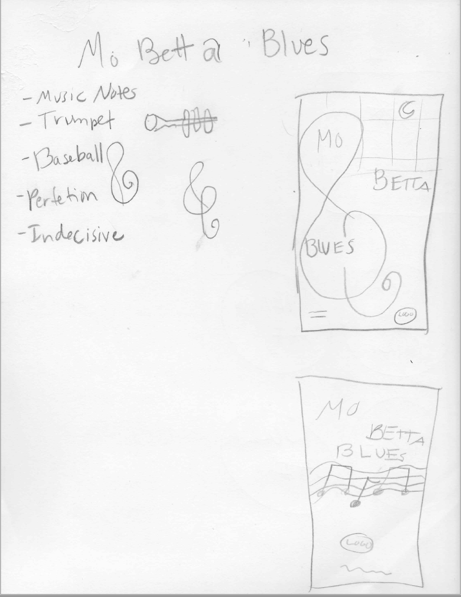
The Director Poster Series ties together three the films "She's Gotta Have It", "Mo' Betta Blues", and "School Daze" by the well-known director Spike Lee for the AFI Silver Theater & Cultural Center. Using design elements typography, symbols, to represent the director.
Process


Week 1
My first round of digital sketches mainly focused on vibrant
colors, and required text such as the titles, location, and main
symbols that I pulled from the films. I chose these colors
specifically because I felt like the tones of the colors represented
the tone of the movies. I also selected these fonts in particular
because I felt like they were a reflection of the movie titles.
I changed the background
colors to deeper hues because the films had very deep meanings and represented
more of Spike Lee’s overall messaging. I began to place the symbols and fonts
on the page in a more strategic way. Each of the posters exemplify
motion and have some type of rhythm, as Spike Lee’s movies always showcase
art, culture, and music. I really liked how the font and the top of the headboard on
the “She’s Gotta Have It” poster, flowed into the motion of the music notes on the
“Mo’ Betta Blues” poster.
However, I still wanted to create more fluid motion for the “School Daze” poster.
I tried to create motion in the “School Daze” poster through the font. I also changed
the symbol here to crossed bones because pride is a very prevalent motif in the
film, and also the symbol that was used to promote the movie. I added silhouettes
to each of the posters because even though Spike Lee chooses great actors to
portray his characters, he places an emphasis on the characters stories, lessons, and
realizations.
Creating motion in the “School Daze” poster was one of the greatest challenges
for me during this project.
